credits
year: 2016
client: semcon
commissionary: forsman & bodenfors
semcon, a ‘human and technological’ font-family

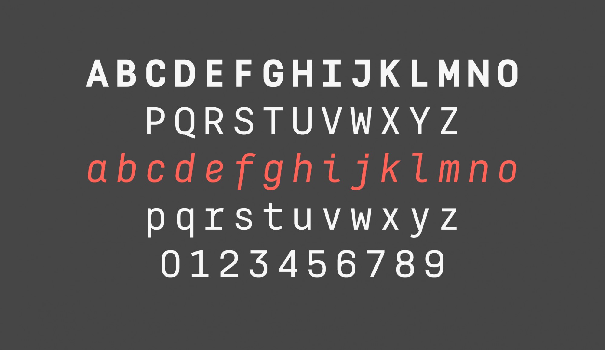
semcon, semcon is a small font-family created for semcon, a swedish company dedicated to engineering and technology which collaborates mainly with enterprises in the sectors of the automotive industry, energy and life sciences.
under the management of forsman & bodenfors, the award-winning swedish agency, author of the new identity, we developed, on the one hand, a customized version of the weight of our font geomanist, specifically the black weight, for a use in headlines. just as the original font, semcon-geomanist is a sans with a modern, clean design that combines geometric shapes with a humanist beat. on the other hand, we develop a completely new family, named simply semcon, composed of three weights (regular, italic & bold) with a much more technological aspect, thought to work in medium-sized headlines and texts blocks.


semcon font has a condensed structure, with a geometric aspect and with a monolinear stroke, since both its vertical and its horizontal strokes have the same visual weight. against the sobriety of the regular weight, the italic version appears warmer thanks to a certain calligraphic reminiscence in its construction. the goal for the semcon font was finding a balance among personality and usability.


year: 2016
client: semcon
commissionary: forsman & bodenfors